.png)
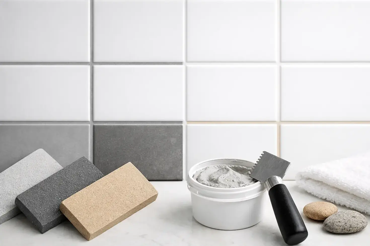
Best Grout Colour for White Tiles
- gheorghesircu

- Jul 5
- 6 min read
White tiles can look sharp and expensive, or flat and unforgiving. In most cases, the difference comes down to the grout. Choosing the right grout colour for white tiles is not a small finishing detail - it changes how clean the surface looks, how much maintenance you notice, and whether the room feels crisp, soft or heavily patterned.
This is where many tile decisions go wrong. People choose the tile first, treat grout as an afterthought, and only notice the effect once the wall or floor is finished. By then, the joints are setting the whole tone of the room. If you want a clean result that still works in daily use, the grout needs to be chosen with the tile, not after it.
How grout colour changes white tiles
White tiles are neutral, but grout is what defines their shape. With white grout, the tile layout blends into a more continuous surface. With grey or darker grout, each tile stands out more clearly. Neither is automatically better. It depends on the tile size, the room, the light and how much contrast you actually want.
On a bathroom wall, bright white grout with white tiles can look fresh and minimal. It suits a calm finish, especially with larger format tiles where the joints are already reduced. The problem is practical rather than visual. White grout shows staining, soap residue and discolouration faster than most people expect, especially in showers and around baths.
A pale grey grout often gives a better balance. It still keeps the overall look light, but it is more forgiving in everyday use. On kitchen splashbacks, bathroom floors and family shower areas, that small shift away from pure white can make the installation easier to live with.
Dark grey or black grout creates a stronger grid. That can work well with metro tiles, patterned layouts and spaces where you want definition rather than softness. It is a deliberate look. If the aim is a quiet, seamless surface, dark grout will do the opposite.
The most common grout colour for white tiles
For most residential projects, light grey is the safest grout colour for white tiles. It gives definition without making the surface look busy, and it hides everyday marks better than white. That is why it is often the first option we discuss on bathrooms, kitchen walls and general floor tiling.
That said, safe does not always mean right. If you are fitting glossy white metro tiles in a period-style bathroom, a mid-grey grout can make the pattern feel more traditional and more graphic. If you are installing large white porcelain tiles in a modern wet room, the same grout may look too busy. The tile format matters just as much as the shade.
Warm whites also need care. Not all white tiles are truly bright white. Some have cream, ivory or stone tones. Pairing those with a cool blue-grey grout can make the tile look dull or slightly dirty. In those cases, a warmer light grey or soft beige-toned grout may suit the tile better.
White grout - when it works and when it does not
White grout works best when the goal is a clean, almost monolithic finish. It suits minimalist bathrooms, simple shower enclosures and walls where you want the tile surface to feel open and bright. It is especially effective with rectified large format tiles and narrow joints.
The downside is upkeep. White grout has very little room for error. If the installation is uneven, you will notice it. If the room gets regular moisture, limescale or product build-up, you will notice that too. On floors, white grout is rarely the most practical choice unless the space is low traffic and properly maintained.
This does not mean white grout should be avoided. It just needs realistic expectations. In a guest bathroom that sees light use, it can be a strong choice. In a busy family shower or a kitchen floor, it often becomes a maintenance issue rather than a design feature.
Grey grout - the most reliable option
Grey grout is popular for a reason. It gives enough contrast to sharpen the tile lines, but not so much that the wall or floor feels harsh. It also covers normal dirt and discolouration far better than white.
Light grey is usually the most flexible. It works well with white ceramic, porcelain and stone-effect tiles across bathrooms, splashbacks and floors. Mid-grey adds more structure and can suit smaller tile formats where you want to highlight layout patterns such as brick bond or herringbone.
Dark grey is more selective. It can look excellent with white metro tiles, especially in kitchens or feature walls, but it creates a much bolder finish. In smaller rooms, too much contrast can make the area feel busier than intended.
Black grout - a design choice, not a neutral one
Black grout with white tiles is high contrast and very defined. It suits industrial-style interiors, monochrome schemes and feature walls where the layout is meant to stand out. Used well, it can look crisp and intentional.
Used in the wrong place, it can dominate the room. It also makes installation accuracy more important, because every joint line becomes a visible part of the design. If tile spacing is inconsistent or cuts are poor, dark grout will highlight it immediately.
There is also a practical point. Black grout does not show the same kind of staining as white, but residue and haze can be more noticeable during installation if the tiles are glossy. The finish needs to be handled properly from the start.
Matching grout to the room
Bathrooms usually benefit from softer grout tones unless the design is built around contrast. White or pale grey tends to keep the room feeling brighter and cleaner. For shower areas and bathroom floors, light grey is often the best balance between appearance and maintenance.
In kitchens, the choice depends on whether the tiles are a background finish or a decorative feature. White tiles with grey grout on a splashback often look sharper and cope better with cooking marks. If the kitchen has a classic metro tile layout, a darker grey can help frame that style.
For floors, practical use matters more than showroom appearance. White grout on white floor tiles can look impressive when first finished, but it is rarely the easiest option long term. Hallways, kitchens and family bathrooms usually perform better with a light or mid-grey joint.
Outdoor areas, terraces and steps need a different mindset again. Dirt, weather and foot traffic mean pale grout can quickly lose its fresh look. In those spaces, a darker tone is often more sensible, provided it still works with the tile colour and overall finish.
Tile size, joint width and finish all matter
The smaller the tile, the more grout you will see. That means grout colour has a stronger visual effect on mosaics and metro tiles than on large format porcelain. A pale grey grout on small white tiles may read as a clear pattern, while the same grout on a 1200 x 600 tile may barely register.
Joint width matters too. Wider joints naturally draw more attention. If you are using a rustic tile with slightly irregular edges, a contrasting grout can enhance character. If you are aiming for a precise contemporary wall, narrower joints and a closer grout match usually work better.
Gloss tiles reflect more light and often make grout lines more noticeable. Matt white tiles tend to soften the contrast slightly. This is why sample boards are useful. A grout shade that looks subtle on paper can look much stronger once set between reflective white tiles.
A practical way to choose grout colour for white tiles
The best approach is to look at the tile in the actual room, under the lighting it will have once finished. Showroom lighting can make grout look lighter or cleaner than it does at home. Natural daylight, warm bathroom lighting and shadow lines all change the result.
It also helps to decide what you want the grout to do. If you want the surface to read as one clean plane, stay close to the tile colour. If you want to show the tile shape and layout, choose contrast. If the room gets hard daily use, lean towards a grout that is easier to maintain rather than the one that looks best only on day one.
This is where an experienced tiler adds value. It is not just about fitting the tiles neatly. It is about understanding how the grout, tile edge, spacing and room use all come together in the final finish. On installation-led projects, that decision often has more impact than clients expect.
If you are choosing between two shades, the slightly softer option is usually the safer one. Strong contrast is effective when it is intentional. If you are unsure, light grey tends to give white tiles the cleanest all-round result without creating unnecessary maintenance.
A good tile finish is not just about the tile itself. Get the grout right, and white tiles look considered, balanced and built to last.


Comments